Introduction: The Power of Color
Color is more than just a decorative choice — it’s a silent language that influences our moods, thoughts, and even behaviors. In interior design, using color strategically can completely transform the feel of a space, making it calm, energizing, cozy, or even luxurious. Understanding the psychology of color gives decorators and homeowners a powerful tool to create intentional, emotion-driven environments.
Whether you’re designing a peaceful bedroom retreat or an invigorating home office, the right color choices can make all the difference. In this article, we’ll explore the fundamentals of color psychology and how to use it effectively in every room of your home.
Understanding Color Psychology
Color psychology is the study of how different colors affect human emotions and behavior. While cultural and personal associations can vary, many emotional responses to colors are surprisingly universal.
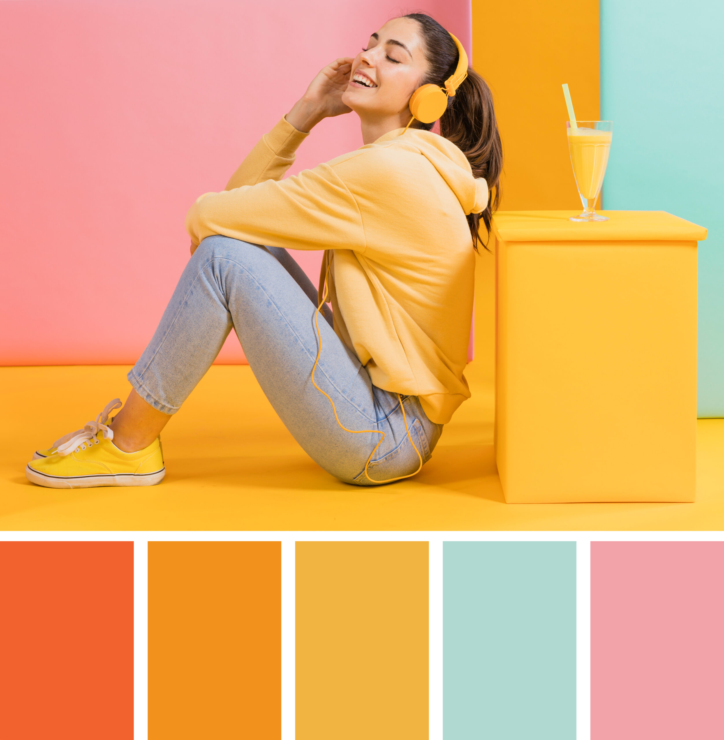
Here’s a quick overview of how some common colors are typically perceived:
- Red: Stimulating, passionate, energetic. Increases heart rate and appetite.
- Blue: Calming, trustworthy, serene. Often used in bedrooms or offices.
- Yellow: Cheerful, warm, and energizing. Promotes creativity.
- Green: Refreshing, natural, and balanced. Associated with health and tranquility.
- Purple: Luxurious, creative, and introspective. Often linked with royalty or spirituality.
- Orange: Friendly, energetic, and social. Good for communal areas.
- White: Clean, fresh, and simple. Suggests openness and minimalism.
- Black: Sophisticated, powerful, and grounding. Best used in accents or bold design themes.
These associations can be used to influence the atmosphere and emotional impact of a room.
The Basics of Color Theory in Design
To effectively apply color psychology in design, it’s helpful to understand the basics of color theory:
- Primary Colors: Red, blue, and yellow. All other colors are created by mixing these.
- Secondary Colors: Orange, green, and purple (created by mixing two primary colors).
- Tertiary Colors: Variations that result from mixing primary and secondary hues.
- Warm Colors: Reds, oranges, and yellows — these evoke warmth and energy.
- Cool Colors: Blues, greens, and purples — often calming and relaxing.
- Neutrals: White, black, gray, beige — can ground or balance vibrant colors.
Color temperature, saturation, and brightness also impact how a color feels. A muted pastel blue might feel relaxing, while a deep navy could feel dramatic and formal.
Room-by-Room Color Psychology Tips
Living Room
The living room is a space for socializing and relaxing, so choose colors that promote warmth and comfort.
- Best choices: Warm neutrals, soft greens, earthy tones, or muted blues.
- Avoid: Overly intense reds or oranges unless used as small accents — they can feel too stimulating in large doses.
Bedroom
This space is all about rest and rejuvenation. Opt for calming, cool tones to promote sleep and relaxation.
- Best choices: Soft blues, gentle greens, lavender, and neutral tones like taupe or soft gray.
- Avoid: Bright yellows or vibrant reds, which can be too energizing.
Kitchen
As the heart of the home, the kitchen benefits from energetic and appetizing colors.
- Best choices: Whites for cleanliness, warm yellows, or even pops of red or orange to stimulate appetite.
- Avoid: Too much dark color — it can make the space feel heavy or smaller.
Bathroom
Bathrooms should feel clean and refreshing.
- Best choices: Whites, light blues, soft greens, or sandy beiges.
- Avoid: Very dark colors, which can feel claustrophobic in small spaces.
Home Office
This space should promote focus and productivity.
- Best choices: Light blues, muted greens, or even subtle yellows to inspire creativity and concentration.
- Avoid: Overly bright or stimulating colors that may distract rather than focus.
Accent Colors and Emotional Touches
Accent walls, décor items, or furniture can introduce strong color psychology without overwhelming a space. For example:
- A red chair in a neutral living room can spark energy.
- Golden yellow cushions can brighten a moody space.
- A deep navy accent wall can add a sense of structure and calm.
If you’re hesitant to commit to bold color, start small. Incorporate vibrant tones in art, pillows, rugs, or vases — these elements can easily be swapped out or layered as seasons or tastes change.
Combining Colors with Intention
Using multiple colors? Be sure to balance them well. Here are a few design principles to guide you:
- The 60-30-10 Rule:
Use one main color for 60% of the room (walls, large furniture), a secondary color for 30% (upholstery, rugs), and an accent color for 10% (pillows, art, décor). - Complementary Colors:
Choose colors opposite each other on the color wheel (like blue and orange) for a bold, vibrant effect. - Analogous Colors:
Use colors next to each other on the color wheel (like blue, green, and turquoise) for a harmonious, relaxed feel.
Cultural and Personal Influences
Keep in mind that color meanings can shift based on culture, experience, or personal memories. While white signifies purity in some cultures, it may represent mourning in others. Likewise, someone may have a personal aversion to yellow due to a childhood memory.
When decorating a personal space, color psychology should be balanced with personal comfort and cultural context. The goal is to create a space that resonates emotionally with those who use it.
Trends vs. Timeless Choices
It’s easy to get swept up in trendy color palettes — like the annual “Color of the Year” releases from paint companies — but timeless design often comes from choosing what feels good rather than what’s currently in style.
That said, trends can be a great source of inspiration. You can incorporate trendy colors in accessories or statement pieces while keeping the core palette classic.
Conclusion: Designing with Emotion in Mind
Color is one of the most powerful elements in interior design — and yet it’s often chosen instinctively or without much strategy. By understanding the psychological impact of color, you can intentionally shape the mood and energy of every room in your home.
Whether you want a serene space to unwind, a bright and cheery kitchen to cook in, or a focused zone to work from home, color psychology gives you the tools to transform your home into a place that supports your lifestyle and emotions.
Next time you pick up a paintbrush or browse throw pillows, remember: you’re not just decorating — you’re designing how a room feels.